Greek Chicken
Architect: N/A
Builder: Clear Sign & Design
Sign Designer: Clear Sign & Design
For more than 30 years, Greek Chicken has been a well-known Southern California source for Authentic Greek cuisine. Over the years, they’ve developed not only a menu that delivers top quality food, but a level of service and an overall customer experience that tie it all together to provide an outstanding value. This value is not based on using the least expensive products, labor, or cooking techniques, but on quality, experience and execution.
Greek Chicken is a business with a long history of high performance and a bright future, to say the least. So when the freeway sign they purchased a few years back was already showing premature signs of age and deterioration, they looked for a new Sign manufacturer that shared their philosophy of quality and value.
What better partnership for a 30+ year old restaurant with a culture of quality than a 30+ year old sign company with similar standards, ethics, and a constant pursuit of excellence. Greek Chicken needed a sign company that could rely on its experience and recommend the long-term advertising investment that was truly needed. The result was a stunning 14’ x 21’ illuminated oval pylon sign with freeway visibility resting 35’ above grade, built with quality materials using skilled labor and proven techniques.
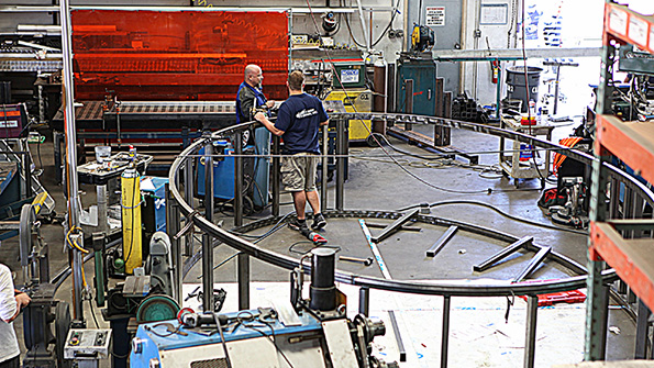
Clear Sign & Design was excited to design and engineer such a unique structure, as circles and ovals are uncommon in our industry due to the added complexity often associated with the fabrication process. And a project of this size was no exception! The four-foot deep steel oval structure was no doubt a difficult task to tackle, but with the right tools and a pool of creative craftsmen on which to draw, Greek Chicken’s pylon sign was a perfect fit for our custom fabrication capabilities.
With longevity and structural integrity in mind, Clear Sign chose rectangular tube over angle, top quality dual printed Flex faces over standard vinyl, metal halide light fixtures over fluorescent lamps – and the list goes on. The automotive paint applied to the pole and the addition of ventilation are among the provisions we added to ensure a long life and ease of service.
When comparing the old product to the new, a few things became quite apparent. Though there may have been some similarities between Clear Sign and the original sign company, the thing that most differentiates Clear Sign is our vision of what Greek Chicken needed, and the impact the right kind of sign could bring to their business. We then brought that vision to life as a quality long-term product that will stand the test of time and become an icon of creative branding, not a liability or an eyesore.
At Clear Sign & Design, we’re passionate about delivering value in the truest sense of the word. In products that last, products built with quality that communicate your branding message, products you can be proud of. If you are interested in finding out how we can use our experience to creating a lasting image or vision for your property or brand, give us a call at 760.736.8111 and lets get started.
“Recently, a very important client of mine was in need of some new signage on their high-profile, high-rise building in Irvine. This sign would be seen from the freeway, commercial planes, and surrounding retail. The responsibility for this sign was delegated to me and it was critical that this sign be seen, day and night!
Thankfully, I had worked with Clear Signs previously and was confident of the quality and professionalism I could expect. Immediately upon installation, I received calls from both the President and the CFO thanking me. Gabe made me look like a hero and will always come highly recommended by me to anyone needing professional signage.”

Steve Lane
Sr. VP/Partner
Voit Real Estate
“From the very beginning Gabe and the team at Clear Signs exhibited a high level of professionalism. The process from bid to installation was flawless. Not only this, but they have completed projects on both of our high rise locations in San Diego and Irvine as well as our boutique shops in Northern California. Their craftsmanship from from Southern California to Northern is amazing! I’d recommend Clear signs for all your signage needs.”

Scharrell Jackson
COO/CFO
Squar Milner
“Urban Housing takes tremendous pride in the quality of our work, and the service we provide to our clients. Selecting sign vendors is no different, which is why Clear Sign has earned a spot on the preferred list after a flawless execution for a key client of ours.”

Lenette Hewitt
VP of Marketing
Urban Partners
“My company has always ascribed to the highest standards in customer service so it’s easy for me to recognize. No matter what size the project, Gabe and the rest of the team at Clear Sign & Design have always given me the support I needed in a timely manner.”

Stacy Lombardo
Sr. VP of Operations
Torrey Pines Bank
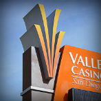
“We have had a great working relationship with Clear Sign for over 10 years and are very pleased with their dedication to creating beautiful signs for Valley View Casino & Hotel. Clear Sign has always treated us fairly and their team is not only efficient but professional. We look forward to a continued partnership and hope to work together for many years to come.”

Joe Navarro
President - CEO
Valley View Casino & Hotel
“We were in a desperate place, 4 days before final inspection/occupancy, and our client's vendor could not deliver any of the code required signage in time. With one call – Clear Sign manufactured and installed nearly 600 code signs with time to spare. This hail mary saved the day and set the new standard for what a preferred vendor can do.”

Joe Bigglione
Sr. Project Manager
CW Driver Builders
“From Florida to San Diego and everywhere in between
Clear Sign has been with us every step of the way handling all of our signage needs no matter where the next race track is located. Nine years and 18 locations later, Steve remains my “sign guy” of choice.”

David Danglard
President - CEO
K1 Speed Indoor Karting
“Its not that I felt Clear Sign couldn’t do the work… but initially I felt more comfortable choosing a vendor that was local to the project which Clear Sign was not. Ironically, my “local” vendor ended up dropping the ball, and Clear Sign picked it up and literally scored a touchdown with their products despite the super tight timeline and custom design requirements. Steve and his team have earned their spot in my list of approved vendors.”

Noah Rosenblatt
Sr. Creative Director
CON-AM Management
“Being a construction manager and choosing a sign vendor from a bid list can be difficult, because having the lowest price rarely nets the desired results. Having worked with Steve and the team over at Clear Sign on a few high profile projects and seeing the benefits first-hand made me a believer. They are now one of my few preferred signage vendors.”

Roger Kazemier
Field Operations Manager
Swinerton Builders
“From day one - Clear Sign understood our philosophy on quality and design, and it showed in the professional execution of our new interior and exterior sign package, replacing the tired looking 10+ year-old original product. This alignment priorities benefitted the entire project, and increased foot traffic didn't hurt either!”

Ryan Krasner
General Manager
Harold Stevens Jewelers
“It was only a short time after being introduced as our builders preferred vendor did I start to realize that Clear Signs capabilities were perfectly suited for my project. The fact that they were able to do the work of what has typically been 3-4 different contractors on a project this size provided an enormous advantage. From interior to exterior… a 4000sqft SS wall mural and LED building lighting Clear Sign had the experience to make my project a success”

Steve Donlon
Director of Construction
Ariel Suites LLC
“As the proud director of one of San Diego’s oldest Theaters It was important for us to maintain our historic animated neon sign. 18 months and tens of thousands of dollars later it was clear our current vendor was in over his head – In the end… it was the talented team at Clear Sign that finally finished the job that others could not, and brought life back to our beloved sign”

David Schulz
Artistic Director
Star Theater of Oceanside
“It can often times be difficult to find subs that act in the best interest of the project on a consistent basis. Gabe and the team at Clear Sign were a Clear exception on our last downtown project. From roaming deadlines, shifting scope and non-ideal site conditions the team at Clear Sign made easy work of a complicated project and did their part to help us see it across the finish line.”

Zach Adams
Sr. Project Manager
OliverMcMilan
“I don’t know if am more surprised at how difficult the sign criteria committee was or that William and the team at Clear Sign stuck with my project for over 16 months in order to get it approved and completed, either way I am pleased at the end result and patience observed .”

Song Gao
Supervisor
Carlsbad Tech


